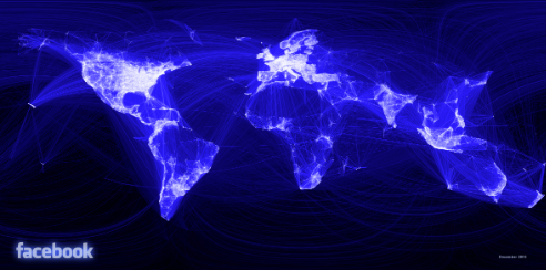
What does the world look like on the Facebook social graph?
Paul Butler, at intern at Facebook’s data infrastructure engineering team, created
the map below based on a sample of about ten million pairs of friends, which he plotted on a blank map with
arcs between them.\n\n

\n\nPaul says:\n
After a few minutes of rendering, the new plot appeared, and I was a bit taken aback by what I saw. The blob had turned into a surprisingly detailed map of the world. Not only were continents visible, certain international borders were apparent as well.
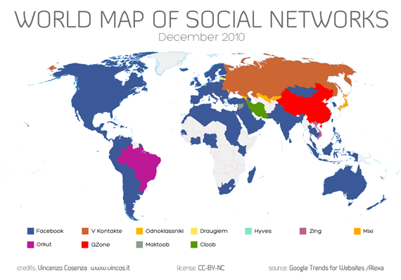
\nAlso this past week,
Vincenzo Cosenza updated
his map (
see Google translation to English) of the most popular social network in various countries:\n\n

\nThese are both amazing views of how the Internet connects us.\n\nWe want to see SpicyNodes used to
visualize social networks on a personal level, so that you can see different clusters of your friends, and browse the social graph to see who else is connected.
 \n\nPaul says:\n
 \nThese are both amazing views of how the Internet connects us.\n\nWe want to see SpicyNodes used to visualize social networks on a personal level, so that you can see different clusters of your friends, and browse the social graph to see who else is connected.
