


Embedding
Nodemap XML
Node content
Settings XML
Javascript
Audio


Home > Archive > Developers/reference > API Reference > Settings XML
Settings XML
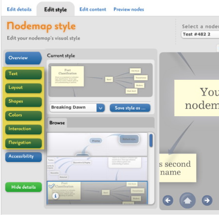
The settings XML file defines the layout’s visual and interactive layer. It controls applied skins, availability of various navigation controls, interaction options and interaction sound settings. The contents of settings XML represent the customizable options of the on-line Edit Style configuration tool (advanced mode is available only to premium users).
Similarly like nodemap XML, the settings file must follow XML document formatting syntax (see Extensible Markap Language (XML) 1.0.
The settings XML file uses easy to understand node names and their attributes. It has six main sections: text, layout, shapes, interaction, navigation, color. Additionally there may be defined an additional metadata section for descriptive information, like settings title, modification time, author etc. These informations have do not affect the layout.
Main sections of the settings XML file:
			    <?xml version="1.0" ?>
			        <style>
			            <metadata>...</metadata> <!– Optional –>
			            <text>...</text>
			            <layout>...</layout>
			            <shapes>...</shapes>
			            <colors>...</colors>
			            <interaction>...</interaction>
			            <navigation>...</navigation>
			     </style>
The XML structure can be compared with tabs of the advanced mode of the on-line Edit Style configurator, which is available for premium users:
Text section
The text section defines fonts and text sizes for three skins: center nodes, non center node labels and panel items. Each font is defined with one <font> node under the <fonts> section of the main <text> node. <fonts> node is the only subsection of <text>. A single <font> node contains three attributes:
<font type="center" size="22" src="Priori_Family.swf" />The type attribute refers to the skin type and there are three supported values:
- type="center", for center node labels, descriptions and alternative widgets,
- type="label", for non center node labels and alternative widgets,
- type="panel", for panel item labels and alternative widgets.
There can be defined up to three fonts for center, and up to two fonts both for label and panel skins. The order of font nodes related to one skin is important. For example, the first occurrence of font type="center" will always define the center node’s label and the second occurrence of type="center" will define the center node’s descriptive text style. Note, that not all skins support all possible combinations; some skins use only two fonts for center or just one font for label but it is valid to define all seven font nodes in the settings XML file.
The size attribute obviously defines the font size.
The src attribute defines the font library file. Font libraries are Flash movies. The complete list of currently supported font libraries can be found in chapter Available font files in the Appendix section below.
Example <text> section:
	<text>
	     <fonts>
	         <font type="center" size="22" src="Priori_Family.swf" />
	         <font type="center" size="28" src="Priori_Family.swf" />
	         <font type="center" size="22" src="Priori_Family.swf" />
	         <font type="label" size="32" src="Priori_Family.swf" />
	         <font type="label" size="12" src="Priori_Family.swf" />
	         <font type="panel" size="14" src="Priori_Family.swf" />
	         <font type="panel" size="12" src="Priori_Family.swf" />
	     </fonts>
	</text>
Layout section
The layout section defines the background of the layout (<background>) and a set of parameters affecting the overall shape and dimensions of generated layout (<orbits>).
Example <layout> section:
	    <layout>
	         <background>
	             <source url="http://www.mydomain.com/images/layout_background.swf"/>
	             <align value="c"/>
	         </background>
	        <orbits>
	             <shape value="0.55" />
	             <radius value="0.5" />
	             <magnetic value="true" />
	             <stagger value="true" />
	             <maxOrbitLevels value="1" />
	         </orbits>
	     </layout>
The <background> node is optional. If omitted, then the layout has solid color background. Otherwise the SpicyNodes player will try to load a background image (.jpg, .png, .gif) of Flash movie (.swf) defined with url attribute of the <source> childnode. The background alignment is defined by the value attribute of <align> child node and it supports seven values:
- align="NW top-left corner,
- align="NE top-right corner,
- align="SW bottom-left corner,
- align="SE bottom-right corner,
- align="C center (no scaling),
- align="F fits on the display (possible scaling but constrained proportions - bias=1),
- align="S stretches the image to fit full display dimensions (both scaling and bias possible),
- <shape> - its value defines the horizontal [if 0.5-1] or vertical [if 0-0.5] bias of the layout.
- <radius> - its value defines the overall radius of the layout [0-1].
- <magnetic> - its value defines whether nodes repel each other [true/false].
- <stagger> - its value defines whether nodes alignment is staggered [true/false].
- <maxOrbitLevels> - its value defines how many orbits (depth levels) are allowed in one layout [1,2,...,n]. Usually it is recommended to use only 1 level but you are free to experiment with this value. The number of nodes on higher levels is limited, so setting maxOrbitLevels to high values does not mean that all those levels will be displayed.
Shape section
The shapes section consist of four subsections, one for each skin - <center>, <nodes>, <labels> and <connectors>. Each subsection top node defines the skin’s filename with the src attribute:
<center src='calligraphy_center.swf’ >...</center>
Complete list of supported skins can be found in chapter Available skin files in the Appendix section below. Each subsection top node has a variable number of children (<param>). Each child defines a different parameter. The number of parameters varies among different skins and skin types. Some skins may have no parameters at all:
<param name="Size" value="1.5"/>
The name attribute is descriptive and the value attribute holds the parameter value. There are two types of values: numerical, usually ranged 0-1 and boolean: true or false.
Example <shapes> section:
	     <shapes>
	         <center src="calligraphy_center.swf" >
	             <param name="Size" value="1.5"/>
	             <param name="Thickness" value="2"/>
	             <param name="Quantity" value="2"/>
	             <param name="Complexity" value="0.9"/>
	             <param name="Stroke" value="0.7"/>
	             <param name="Shape" value="1"/>
	         </center>
	         <label src="spicynodes_labels.swf">
	             <param value="0.3" name="Transparency" />
	         </label>
	         <connector src="spicynodes_connectors.swf">
	             <param name="Opacity" value="1"/>
	             <param name="Short" value="1.2"/>
	             <param name="Thickness" value="0.66"/>
	             <param name="Bending" value="1"/>
	         </connector>
	         <node src="calligraphy_nodes.swf">
	             <param name="Size" value="1.2"/>
	             <param name="Thickness" value="2"/>
	             <param name="Quantity" value="2"/>
	             <param name="Complexity" value="0.9"/>
	             <param name="Stroke" value="0.7"/>
	             <param name="Shape" value="1"/>
	         </node>
	     </shapes>
Complete list of supported skins and their parameters can be found in chapter Available skins in the Appendix section below.
Interaction section
The interaction section can be used to control interaction sounds settings and a list of interface properties and characteristics.
Example <interaction> section:
	     <interaction>
	         <audio>
	             <audio name="henrique - ambient1"/>
	             <volume value="0.7" />
	             <mute value="true" />
	         </audio>
	         <more>
	             <drag value="true" />
	             <spin value="0.329" />
	             <transition_speed value="0.75" />
	             <use_expansion value="true" />
	             <use_back_icon value="true" />
	             <use_visited_icon value="true" />
	         </more>
	     </interaction>
The <audio> subsection has three children: <audio>, <volume> and <mute>. The first defines the audio set name. A complete list of supported audio sets can be found in chapter Available audio sets in the Appendix section below. If no interactive sounds are planned, then the name attribute should be empty of set to NULL.
The <volume> node value attribute holds the initial interaction sounds volume. It ranges from 0 to 1. The <mute> node value attribute supports true or false. If true, then sounds are muted initially and it depends on the nodemap visitor whether he toggles sounds on with the volume slider.
Note, that the interactive sounds will not play if the volume slider is not available in the navigation panel (see Navigation section). The reason is to prevent situations when the user is not be able to turn off interaction sounds.
The <more> subsection has six children.- <drag> - its value defines whether the layout is draggable [true/false].
- <spin> - its value defines the rotation speed when dragging is true [0-1].
- <transition> - its value defines the focus change animation speed [0-1].
- <use_expansion> - its value defines whether the expansion widget is available [true/false].
- <use_back_icon> - its value defines whether the back icon is displayed on ancestor nodes [true/false].
* ‘’<’'use_visited_icon’'>’' - its ‘'value’’ defines whether the visited icon is displayed on visited nodes
[true/false].
Navigation section
The navigation sections contains fours subsections: <panels>, <widgets>, <messages> and <center>. Navigation defines which panel and help skins are in use, what panel controls are available and finally allows overriding the default texts of panel item labels and a group of commonly used informative messages.
The first subsection <panels> has four children: <navpanel>, <position>, <autohide> and <helppanel>:
	     <panels>
	         <navpanel swf="chapbook_panel.swf" />
	         <position value="top" />
	         <autohide value="true" />
	         <helppanel swf="spicynodes_help.swf" />
	     </panels>
The <navpanel> node swf attribute defines the panel skin file. Complete list of supported panel skins can be found in chapter Available panels in the Appendix section below. Navigation panels can be aligned to top or bottom and this alignment can be set in <position> node value attribute. An additional option is hiding the navigation panel when mouse cursor is away. For this purpose the <autohide> node value attribute can be set to true or false. The last node <helppanel> defines the file responsible for displaying the help panel. Its swf attribute can take one of the help panel skins listed in the Available panels chapter.
The <widgets> subsection can be used to toggle each of the navigation panel buttons, sliders or the search bar. Each control is defined in a separate child node, named correspondingly to its use. The value attribute taking ture or false determines the availability of this control. Additionally, each node can define a CDATA text section. Its content overrides the control’s label. It may be used for example to display a navigation panel with captions in other language.
Example <widgets> subsection:
	     <widgets>
	         <zoom value="true"><![CDATA[Zoom]]></zoom>
	         <focus value="true"><![CDATA[Focus]]></focus>
	         <search value="true"><![CDATA[Search]]></search>
	         <previous value="true"><![CDATA[Previous]]></previous>
	         <next value="true"><![CDATA[Next]]></next>
	         <home value="true"><![CDATA[Home]]></home>
	         <help value="true"><![CDATA[Help]]></help>
	         <volume value="true"><![CDATA[Volume]]></volume>
	         <fullscreen value="true"><![CDATA[Full screen]]></fullscreen>
	     </widgets>
Two final subsections - <messages> and <center> define custom texts messages. Each text message has a separate child node with a CDATA section. In <messages> there can be defined no-search-results message (<searchNone>) and tooltip captions for: zoom slider (<zoom>), focus slider (<focus>), volume slider (<volume>) and for volume slider mute toggle (<volumeOff>).
	     <messages>
	         <searchNone><![CDATA[Sorry, there are no results for this query]]></searchNone>
	         <zoom><![CDATA[General display enlargement]]></zoom>
	         <focus><![CDATA[Enlargement of the focus node respect the general display]]></focus>
	         <volume><![CDATA[Control sounds volume level]]></volume>
	         <volumeOff><![CDATA[Mute all sounds]]></volumeOff>
	     </messages>
	     <center>
	         <gotopage><![CDATA[Go to page...]]></gotopage>
	         <gotonodes><![CDATA[Go to nodemap...]]></gotonodes>
	     </center>
The <center> subsection defines alternative captions for the link button of the center node. Depending on type of reference – web page or nodemap (an XML file), there are two nodes, accordingly <gotopage> and <gotonodes>.
Color section
Layout colors are defined in the <colors> section. It is one node with minimum two children and maximum sixteen children named <color> (there may be more than sixteen children, but only first sixteen are considered). Each <color> has a value attribute which defined the color number in 0xRRGGBB format, where RR is the hexadecimal value of red channel, GG – green channel and BB – blue channel.
Example <color> section:
	     <colors>
	         <color value="0xffffff" />
	         <color value="0x000000" />
	         <color value="0xa7d7d7" />
	         <color value="0x212121" />
	         <color value="0xefefef" />
	         <color value="0xff7722" />
	         <color value="0x1f1f00" />
	         <color value="0xe7e7e7" />
	         <color value="0x37fc20" />
	         <color value="0x212121" />
	         <color value="0x414141" />
	         <color value="0xE0E7DA" />
	         <color value="0x293239" />
	         <color value="0x00ffff" />
	         <color value="0x212121" />
	         <color value="0x999999" />
	     </colors>
First two colors are required in the settings XML file. The first one defines a solid color of the whole display background. The second one defines the default labels text. The pattern for all other colors depends on applied skins. The internal color management uses alternative colors for skin elements depending on the number of defined colors, that is why the same color may apply to completely different elements when there are seven colors in the palette than when there are ten colors.
Because besides the first two colors in the palette it is difficult to determine color and display elements correspondence, in many cases setting up the complete palette requires many trials. The on-line Edit Style advanced mode configurator, which is available for premium users may be helpful for generation a desired palette using various keys.
Appendix
Available font files
Each available font is divided into five libraries: regular, bold, italic, bold-italic, complete set (regular bold, italic and bold-italic in one). The complete set of fonts is an option available only for premium users. The complete style libraries have larger file size, this is why it is recommended to use complete font sets only in case when it is planned mixing font style in the scope of one group of text elements, for example labels or descriptions. Otherwise, using a single font style library is a better option.
Usage example:
	<text>

	<fonts>

	...

	<font type="center" size="22" src="Berling_bold.swf" />

	…

	</fonts>

	</text>
The following is a list of available font libraries and their style sets:
Berling
- Berling.swf (regular)
- Berling_bold.swf (bold)
- Berling_italic.swf (italic)
- Berling_bold_italic.swf (italic)
- Berling_Family.swf (whole family)
Excelsior
- Excelsior.swf (regular)
- Excelsior_bold.swf (bold)
- Excelsior_italic.swf (italic)
- Excelsior_bold_italic.swf (italic)
- Excelsior_Family.swf (whole family)
- Fujiyama.swf (regular)
- Fujiyama_bold.swf (bold)
- Fujiyama_italic.swf (italic)
- Fujiyama_bold_italic.swf (italic)
- Fujiyama_Family.swf (whole family)
Georgia
- Georgia.swf (regular)
- Georgia_bold.swf (bold)
- Georgia_italic.swf (italic)
- Georgia_bold_italic.swf (italic)
- Georgia_Family.swf (whole family)
Helvetica
- Helvetica.swf (regular)
- Helvetica_bold.swf (bold)
- Helvetica_italic.swf (italic)
- Helvetica_bold_italic.swf (italic)
- Helvetica_Family.swf (whole family)
Impact
- Impact.swf (regular)
- Impact_bold.swf (bold)
- Impact_italic.swf (italic)
- Impact_bold_italic.swf (italic)
- Impact_Family.swf (whole family)
Priori
- Priori.swf (regular)
- Excelsior_bold.swf (bold)
- Excelsior_italic.swf (italic)
- Excelsior_bold_italic.swf (italic)
- Excelsior_Family.swf (whole family)
Trebuchet
- Trebuchet.swf (regular)
- Trebuchet_bold.swf (bold)
- Trebuchet_italic.swf (italic)
- Trebuchet_bold_italic.swf (italic)
- Trebuchet_Family.swf (whole family)
Verdana
- Verdana.swf (regular)
- Verdana_bold.swf (bold)
- Verdana_italic.swf (italic)
- Verdana_bold_italic.swf (italic)
- Verdana_Family.swf (whole family)
Available skins
Each skin can have four elements – center, nodes, labels and connectors.
The center skins refer to visuals of the currently selected node – this is its background, text elements, scrolls and other widgets.
The nodes skin refer to visuals of all displayed nodes besides the currently selected one. Nodes skins includes node backgrounds.
The labels skins refer to labels of all displayed nodes besides the currently selected one. All available labels skins are similar. The main difference is how they adjust font sizes for different groups of nodes, like ancestor noes of nodes with higher depth.
The connectors skins refer to all visible connectors between nodes. There are arrows, lines, bezier curves etc.
The complete set of these elements is implemented only for some skins but not for all. Some skins have only one or two skin element (for example nodes and/or connectors). In these cases their elements need to be mixed with elements other skins.
Usage example – Calligraphy center skin:
	    <shapes>
	         ...
	         <center src="calligraphy_center.swf" >
	             <param name="Size" value="1.5"/>
	             <param name="Thickness" value="2"/>
	             <param name="Quantity" value="2"/>
	             <param name="Complexity" value="0.9"/>
	             <param name="Stroke" value="0.7"/>
	             <param name="Shape" value="1"/>
	         </center>
	         …
	     </shapes>
Note, it is required to place all parameters in the exact order.
The following is a list of available skins with their parameters and parameter ranges
Chapbook
Center
<center src="chapbook_center.swf" >
Parameters: None
Nodes
<center src="chapbook_nodes.swf" >
Parameters: None
Labels
<center src="chapbook_labels.swf" >
Parameters:
<param name="Opacity" value="0.5"/>
Opacity of the label background if its node contains an bitmap. Range [0-1]
Connectors
<center src="chapbook_connectors.swf" >
- <param name="Thickness" value="0.75"/>
Thickness of single connector line. Range [0-1] - <param name="Opacity" value="0.15"/>
Opacity of connector lines. Range [0-1] - <param name="Number" value="0.15"/>
Number of parallel connector lines; depending on range 1 to 12 lines. Range [0-1] - <param name="Internal Margin" value="0.18"/>
Offset between parallel lines. Range [0-1] - <param name="Blur" value="0.75"/>
Blurred start and end points of connector lines. Range [0-1] - <param name="Length" value="0.5"/>
Length of connector lines. Range [0-1] - <param name="Center offset" value="0.5"/>
Offset to the focus node. Range [0-1]
SpicyNodes
Center
<center src="spicynodes_center.swf" >
Parameters:
- <param name="Opacity" value="0.75"/>
Opacity of the background. Range [0-1] - <param name="Corner Roundness" value="0.75"/>
Roundness of background rectangle corners. Range [0-1] - <param name="Edge Thickness" value="0.75"/>
Thickness of the background bounds. Range [0-1] - <param name="Shadow" value="0.75"/>
Strength of the drop shadow. Range [0-1] - <param name="Padding" value="0.75"/>
Padding between background bounds to center node contents. Range [0-1]
Nodes
<center src="spicynodes_nodes.swf" >
Parameters:
- <param name="Opacity" value="0.75"/>
Opacity of the background. Range [0-1] - <param name="Corner Roundness" value="0.75"/>
Roundness of background rectangle corners. Range [0-1] - <param name="Edge Thickness" value="0.75"/>
Thickness of the background bounds. Range [0-1] - <param name="Shadow" value="0.75"/>
Strength of the drop shadow. Range [0-1] - <param name="Padding" value="0.75"/>
Padding between background bounds to center node contents. Range [0-1]
Labels
<center src="spicynodes_labels.swf" >
Parameters:
<param name="Opacity" value="0.5"/>
Opacity of the label background if its node contains an bitmap. Range [0-1]
Connectors
<center src="spicynodes_connectors.swf" >
Parameters:
- <param name="Opacity" value="0.75"/>
Opacity of the connector arrow. Range [0-1] - <param name="Length" value="0.15"/>
Length of the arrows. Range [0-1] - <param name="Thickness" value="0.15"/>
Arrow thickness. Range [0-1] - <param name="Bending" value="0.18"/>
The bending angle of arrows. Range [0-1]
Calligraphy
Center
<center src="calligraphy_center.swf" >
Parameters:
- <param name="Size" value="1"/>
Size of the focus node’s background. Range [1-3] - <param name="Thickness" value="3"/>
Thickness of the background’s edge. Range [1-15] - <param name="Quantity" value="0.5"/>
Number of edge revolutions around the background. Range [1-3] - <param name="Complexity" value="0.75"/>
Additional irregularities of the edge. Range [0-1] - <param name="Stroke" value="0.75"/>
Stroke thickness irregularities. Range [0-1] - <param name="Shape" value="1"/>
Roundness of the background. The higher value, the more rectangular is the focus node’s background. Range [2-0]
Nodes
<center src="calligraphy_nodes.swf" >
Parameters:
- <param name="Size" value="1"/>
Size of the focus node’s background. Range [1-3] - <param name="Thickness" value="3"/>
Thickness of the background’s edge. Range [1-15] - <param name="Quantity" value="0.5"/>
Number of edge revolutions around the background. Range [1-3] - <param name="Complexity" value="0.75"/>
Additional irregularities of the edge. Range [0-1] - <param name="Stroke" value="0.75"/>
Stroke thickness irregularities. Range [0-1] - <param name="Shape" value="1"/>
Roundness of the background. The higher value, the more rectangular is node’s background. Range [2-0]
Labels
<center src="calligraphy_labels.swf" >
Parameters: None
Connectors
<center src="calligraphy_connectors.swf" >
Parameters:
- <param name="Thickness" value="2"/>
Thickness of the connector stroke. Range [1-10] - <param name="Active thickness" value="5"/>
Thickness of the active connector stroke. Active means ancestors path or mouse cursor roll over. Range [1-10] - <param name="Length" value="0.15"/>
Length of the connector. Range [0-1]
Vertex
Center
<center src="vertex_center.swf" >
Parameters:
- <param name="Size" value="0.1"/>
Overall size of the focus node’s “hull". Range [0-1] - <param name="Height" value="0.7"/>
Height of the focus node’s “hull". Range [0-1] - <param name="Number" value="0.5"/>
Number of vertices constructing the hull. Range [0-1] - <param name="Random Angle" value="0"/>
Randomness of angles between neighboring vertices. Range [0-1] - <param name="Alpha" value="0.75"/>
Opacity of the hull’s faces (edges are always opaque). Range [0-1] - <param name="Contrast" value="1"/>
The bigger contrast the more noticeable is the difference between bight and shaded faces. Range [0-1] - <param name="Color Variation" value="1"/>
Strength of the default focus node color randomization. Range [0-1] - <param name="Random Number" value="1"/>
Strength of randomization of the Number of hull’s vertices. Range [0-1]
Nodes
<center src="vertex_nodes.swf" >
Parameters:
- <param name="Size" value="0.1"/>
Overall size of nodes’ “hull". Range [0-1] - <param name="Height" value="0.7"/>
Height of the nodes’ “hull". Range [0-1] - <param name="Number" value="0.5"/>
Number of vertices constructing the hull. Range [0-1] - <param name="Random Angle" value="0"/>
Randomness of angles between neighboring vertices. Range [0-1] - <param name="Alpha" value="0.75"/>
Opacity of the hull’s faces (edges are always opaque). Range [0-1] - <param name="Contrast" value="1"/>
The bigger contrast the more noticeable is the difference between bight and shaded faces. Range [0-1] - <param name="Color Variation" value="1"/>
Strength of the default focus node color randomization. Range [0-1] - <param name="Random Number" value="1"/>
Strength of randomization of the Number of hull’s vertices. Range [0-1]
Connectors
<center src="vertex_connectors.swf" >
Parameters:
- <param name="Number" value="0.3"/>
Number of connector edges. Range [0-1] - <param name="Thickness" value="5"/>
Thickness of connector edges. Range [0-1] - <param name="Alpha" value="0.15"/>
Opacity of connector edges. Range [0-1]
Clouds
Center
<center src="clouds_center.swf" >
Parameters:
- <param name="Size" value="25"/>
Size of cloud’s bumps. Not the overall size of the background. Range [1-100]
- <param name="Quantity" value="11"/>
The number of cloud bumps. Range [3-20]
- <param name="Size Randomness" value="0.5"/>
Strength of randomization of cloud’s bumps (not the overall background size). Range [0-1]
- <param name="Adjustment" value="1"/>
Adjustment of cloud’s bumps around the background – from ordered to chaotic. Range [0-5]
- <param name="Padding" value="0.75"/>
Padding between background bounds to center node contents. Range [0-1]
Nodes
<center src="clouds_nodes.swf" >
Parameters:
- <param name="Size" value="25"/>
Size of clouds’ bumps. Not the overall size of the backgrounds. Range [1-100]
- <param name="Quantity" value="11"/>
The number of clouds’ bumps. Range [3-20]
- <param name="Size Randomness" value="0.5"/>
Strength of randomization of clouds’ bumps (not the overall background size). Range [0-1]
- <param name="Adjustment" value="1"/>
Adjustment of clouds’ bumps around the backgrounds – from ordered to chaotic. Range [0-5]
Labels
<center src="clouds_labels.swf" >
Parameters: None
Boxes
Nodes
<center src="boxes2_nodes.swf" >
Parameters: None
Connectors
<center src="boxes2_connectors.swf" >
Parameters:
- <param name="Quantity" value="3"/>
Number of curved connectors. Range [1-10] - <param name="Thickness" value="20"/>
Thickness of the main connector. Range [0-75] - <param name="Complexity" value="3"/>
Irregularities of connectors. Range [0-10] - <param name="Dashing" value="1"/>
Shape of the main connector – from solid to dashed. Range [0-5] - <param name="Actice Thickness" value="0.5"/>
Additional thickness of active connector (ancestor path or mouse cursor roll over). Range [0-1]
Bull Eye
Nodes
<center src="bull_eye_nodes.swf" >
Parameters:
- <param name="Inner dot size" value="0.2"/>
Radius of the most inner dot. Range [0-1] - <param name="Middle dot size" value="0.25"/>
Radius of the middle inner dot. Range [0-1] - <param name="Outer dot size" value="0.3"/>
Radius of the outer dot. Range [0-1]
Connectors
<center src="boxes2_connectors.swf" >
Parameters:
- <param name="Shape" value="1"/>
Shape ranges from contracted to infrated. Range [0-2] - <param name="Length" value="1"/>
Overall length of connectors. Range [0.3-2] - <param name="Gradient" value="0.5"/>
Strength of color gradient effect. Range [0-10] - <param name="Alpha" value="0.5"/>
Opacity of connectors. Range [0-1] - <param name="Thickness" value="0.5"/>
Thickness of connectors. Range [0-1]
Left Hand
Nodes
<center src="lh_nodes.swf" >
Parameters:
- <param name="Size" value="1"/>
Size of node’s background . Range [0.5-3] - <param name="Thickness" value="0.25"/>
Thickness of the composing line. Range [0-1] - <param name="Length" value="1"/>
Length of the composing line. Range [0.5-1.3] - <param name="Complexity" value="0.5"/>
Amount of irregularities. Range [0-1] - <param name="Fill intersections" value="TRUE"/>
Whether the composing line crossing produce closed, opaque shapes. Values [TRUE/FALSE] - <param name="Speed" value="0.5"/>
Speed of animated rotation of the composing line. Range [0-1] - <param name="Motion Type" value="0.3"/>
Modifies the animated rotation from swirl to wiggle. Range [0-1]
Connectors
<center src="lh_connectors.swf" >
Parameters:
- <param name="Number" value="1"/>
Number of connector curves. Range [1-5] - <param name="Thickness" value="0.25"/>
Thickness of the connector curves. Range [0-1] - <param name="Complexity" value="2"/>
Amount of irregularities. Range [0-10] - <param name="Amplitude" value="10"/>
Amplitude of connector curves. Range [0-20] - <param name="Frequency" value="0"/>
Frequency of animated oscillations. Range [0-20] - <param name="Speed" value="350"/>
Speed of animated oscillations. Range [1000-10] - <param name="Hashes" value="TRUE"/>
Toggle visibility of hashes. Values [TRUE/FALSE] - <param name="Hashes Length" value="3"/>
Length of hashes. Range [0-20]
Orbs
Nodes
<center src="orbs2_nodes.swf" >
Parameters: None
Spirograph
Nodes
<center src="spiro_nodes.swf" >
Parameters:
- <param name="Radius" value="30"/>
Outer radii of backgrounds. Range [10-100] - <param name="Inner radius" value="0.3"/>
Inner radii of backgrounds. Range [0.05-0.45] - <param name="Offset" value="0.2"/>
Shape’s offset. Range [0-1] - <param name="Fill intersections" value="TRUE"/>
Whether the line crossing produce closed, opaque shapes. Values [TRUE/FALSE] - <param name="Deformation" value="0"/>
Strength of deformation. Range [0-1]
Stars
Nodes
<center src="stars_nodes.swf" >
Parameters:
- <param name="Radius" value="1"/>
Outer radius of stars. Range [0.2-3] - <param name="Border" value="2"/>
Width of border line. Range [0-30] - <param name="Arms" value="5"/>
Number of star arms. Range [3-25] - <param name="Inner radius" value="0.5"/>
Inner radius of stars. Range [0-1] - <param name="Arms Shape" value="4"/>
Ranges from twirled to looped. Default value 4 means straight shape (classic). Range [0-8] - <param name="Randomization" value="0"/>
Higher values produce uneven arms – random length and angle. Range [0-1.2] - <param name="Circle" value="0"/>
Radius of an internal cirlce. Range [0-1]
Folder
Connectors
<center src="folder_nodes.swf" >
Parameters:
- <param name="Opacity" value="1"/>
Opacity of connectors. Range [0-1] - <param name="Thickness" value="0"/>
Thickness of connector stroke (zero means hairline). Range [0-1] - <param name="Tautness" value="5"/>
Ranges from taut to relaxed (bended). Range [0-1]
Available audio sets
Currently there available are ninety (19) audio sets. Named for two authors, the sound sets are divided into groups of styles, like arcade, natural, renaissance, subtle, drum and newage.
Usage example:
	<interaction>

	<audio>

	<audio name="henrique - ambient1"/’'>’'

	<volume value="0.7" />

	<mute value="false" />

	</audio>

	…

	</interaction>
The following is the complete list of audio set names:
- henrique – ambient1,
- henrique – arcade1,
- henrique – arcade2,
- henrique – natural1,
- henrique – renaissance1,
- henrique – subtle1,
- henrique – subtle2,
- tito – ambient1,
- tito – ambient2,
- tito – ambient3,
- tito – drum1,
- tito – natural1,
- tito – natural2,
- tito – natural3,
- tito – renaissance1,
- tito – subtle1,
- tito – subtle2,
Available panels (panels + help panels)
Each navigation panel supports the same list of controls, which are:- Help button – opens the help panel.
- Full screen button – toggles between normal and full screen modes.
- Volume slider – changes the overall volume level (applies to interaction sounds and media).
- Zoom slider – changes the overall display zoom.
- Focus slider – increases the size of the focus node reducing at the same size other nodes size.
- Previous node – navigate to the previously selected node.
- Home node – navigate to the home node.
- Next node – navigate to the next sibling or child or next node in history (if previous was used).
- Search bar – input for search query.
Controls can be enabled or disabled in <style><navigation><widgets> subsection of the settings XML file. Panels can be aligned to the top or bottom edge of the display (<style><navigation><panels><position>). There is also an option to hide the navigation panel and display it on mouse cursor proximity (<style><navigation><panels><autohide>).
Available navigation panels:
- chapbook_panel.swf
- spicynodes_panel.swf
- clouds_panel.swf
- calligraphy_panel.swf
Usage example:
	<panels>

	<navpanel swf="chapbook_panel.swf" />

	<position value="top" />

	<autohide value="true" />

	<helppanel swf="spicynodes_help.swf" />

	</panels>
Help panels provide information about keyboard short-cuts and also allow changing global text size to one of three sizes: small, normal, large.
Available navigation panels:- chapbook_help.swf
- spicynodes_help.swf
- clouds_help.swf

